Ratio Anchor Charts: A Visual Guide for Students and Teachers
Ratio anchor charts serve as powerful visual tools in mathematics education. These charts display key information about ratios in an organized, easy-to-understand format that students can reference throughout their learning journey. Whether you're a teacher preparing classroom resources or a student wanting to reinforce your understanding, anchor charts make abstract ratio concepts more accessible and memorable.
What Is a Ratio Anchor Chart?
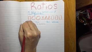
A ratio anchor chart is a reference display that outlines the essential elements of ratios and related mathematical concepts. Teachers typically create these charts on large poster board or display them digitally for classroom use. The primary purpose is to provide students with a constant visual reminder of how ratios work and how to apply them in different situations.
These charts break down complex ratio concepts into simpler parts. They often include definitions, examples, visual models, and step-by-step processes for solving ratio problems. By having this information visible at all times, students can refer back to it during independent work or group activities without needing to interrupt the teacher.
Key Components of an Effective Ratio Anchor Chart
When creating a ratio anchor chart, certain elements help make it most useful for students. A well-designed chart typically includes several key components that work together to support learning.
- Clear definition of ratios – A simple explanation of what a ratio represents, such as comparing two quantities
- Multiple examples – Real-world and abstract examples showing ratios in action
- Visual representations – Pictures, diagrams, or models that illustrate ratio relationships
- Comparison symbols – How to read and write ratios using colons, fractions, and "to" language
- Practice problems – Sample questions students can try using the information on the chart
Common Ratio Formats to Feature
Students often benefit from seeing the three different ways to express ratios. Your anchor chart should display each format clearly:
- Using a colon (3:4)
- Using a fraction (3/4)
- Using the word "to" (3 to 4)
Showing all three formats side by side helps students recognize that these represent the same relationship and understand how to convert between them.
How to Create a Ratio Anchor Chart
Creating an effective anchor chart requires thoughtful planning. Start by identifying the main concepts your students need to remember about ratios. Focus on one or two key ideas per chart rather than overwhelming students with too much information at once.
Begin with a strong title that clearly identifies the chart's purpose. Add a definition using student-friendly language. Then, build out examples that progress from simple to more complex. Include visual models such as tape diagrams or double number lines to help students see the proportional relationships.
Use color strategically to highlight important information. For instance, you might use one color for the definition, another for examples, and a third for step-by-step processes. This visual organization helps students quickly find the information they need.
Including Rates on Your Chart
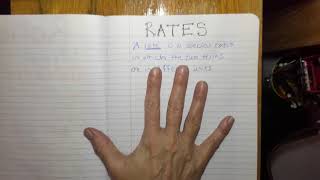
Many ratio anchor charts also incorporate information about rates. A